
Create Your Own Font on the iPad
Peggy Dean · Top Teacher | The Pigeon Letters
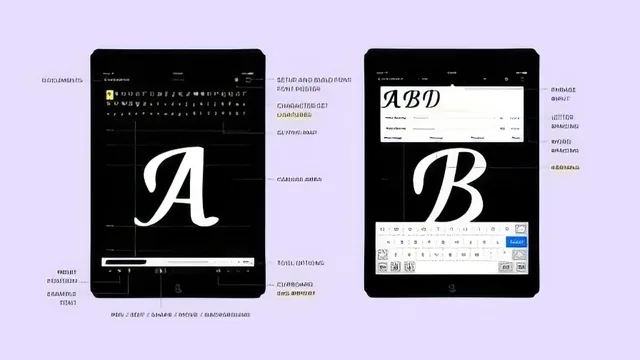
Build a fully functional custom font on an iPad in 33 minutes using one $5 app and an Apple Pencil.
Peggy Dean's class delivers exactly what its title promises and nothing more: a start-to-finish walkthrough of building a working font on an iPad using the app iFontMaker. In just over half an hour, it moves from equipment setup through typeface anatomy, letter drawing, numbers and symbols, kerning, export, and finally creating weight variants. For a Skillshare "beginner" class this length, that is a genuinely complete arc, not a teaser that stops before the payoff.
What the course actually covers
The anatomy lesson is the strongest piece of instruction in the class. Dean runs through baseline, x-height, cap height, ascender and descender lines, then moves into letter-part vocabulary: arms, legs, bars, bowls, counters, shoulders, serifs (bracketed versus unbracketed), and terminals. This section gives a beginner real vocabulary, not just a vague sense of "make the letters look nice," and it pays off later when she references those terms while adjusting individual glyphs.
The actual font-building demonstration is practical and hands-on. She shows how to select a base guide font (including italic angles), how to lay down strokes and add calligraphic weight, and how to use the smoothing and node-adjustment tools to clean up rough joins. The copy-and-paste shortcut for accented letters and repeated glyph shapes (pasting a finished O onto a Q, or a base A onto every accented variant) is a genuinely useful time-saver that a beginner would not think to look for on their own.
The kerning section is where the class earns its keep. Dean walks through the app's pair-preview and sample-word screens, dragging individual glyphs closer or farther apart and explaining how adjustments propagate across matching pairs. This is the part of font-making most tutorials skip, and seeing it demonstrated concretely, letter pair by letter pair, is worth the price of admission on its own.
Where it falls short
The class is a software tutorial first and a design lesson second. Once the anatomy vocabulary is introduced, most of the running time is Dean narrating her own screen actions rather than teaching principles a student could apply independently. There is little discussion of how to actually design a cohesive letterform style, how to plan stroke contrast, or how to avoid common beginner mistakes before they happen; instead the class shows her fixing mistakes after the fact.
The Windows install process is explicitly waved off with an apology and a suggestion to search online, which is a real gap for any student not on a Mac. The export and "make it official" steps are also covered quickly, with less attention than the drawing and kerning sections.
The final project asks only for a screenshot of the finished font, which is a low bar that does little to push students toward refining their work further.
As a narrow, single-tool tutorial, the class succeeds. It is efficient, concrete, and gives a hobbyist calligrapher a real path from iPad sketch to installed font file. It is not a font design education, and students expecting principles that transfer beyond iFontMaker should look elsewhere.
The standout
The kerning walkthrough, which shows how dragging individual glyph pairs in the preview panel and cycling through sample word lists catches awkward spacing a beginner would otherwise miss entirely.
What you will learn
- Core typeface anatomy: baseline, x-height, cap height, ascender, descender, bowl, counter, terminal, serif types
- How to draw and refine consistent letterforms in iFontMaker using stroke weight, smoothing, and node adjustment tools
- How to build numbers, symbols, and accented extended-alphabet characters efficiently by copying and pasting base glyphs
- How to kern letter pairs using the app's preview and sample-word tools for natural-looking spacing
- How to export, build, and install a working font file on a desktop computer
- How to duplicate a font file and adjust glyph width to produce light and heavy weight variants
Best for: A hand-lettering or calligraphy hobbyist with an iPad Pro and Apple Pencil who wants to turn an existing personal script into a usable digital font without learning Illustrator or Glyphs.
Skip it if: Anyone without an iPad Pro and Apple Pencil, or anyone hoping to learn font design theory, spacing systems, or professional type production standards in depth.