
Create Irresistible YouTube Thumbnails with Canva
Ronny Hermosa · Your Go-To Canva Guru
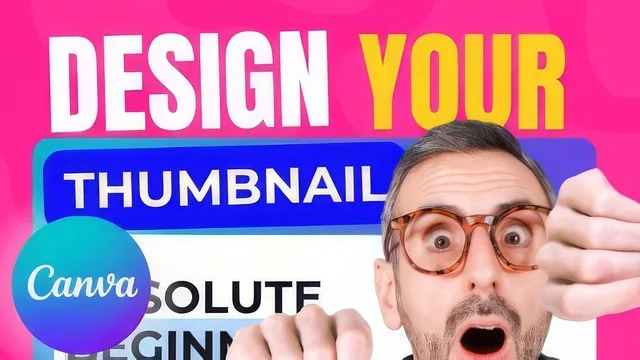
Two Canva insiders hand you two real high-performing thumbnails and rebuild them stroke by stroke, but the class project has no floor to stand on.
What it actually covers
The course opens with a plain premise: only two levers move YouTube views, the title and the thumbnail, and this class only touches the second. Ronny and Diana split the teaching duties cleanly. Diana runs the trends lecture, walking through a deliberately built catalog of recurring thumbnail patterns pulled from real channels: the doodled-silhouette look popular with lifestyle creators, the six "universal" facial expressions (happiness, sadness, surprise, fear, anger, disgust), pointing-finger composition, playlist consistency tricks, split-image formats (before/after, versus, two-scene), and the subject-standing-in-front-of-text depth effect. It is a genuinely useful taxonomy, and naming specific channels and creators for each trend gives it more weight than a generic "study successful thumbnails" tip would.
Ronny then takes over for the strategy lecture, distilling the trends into two rules: show your face with a recognizable expression, and use one or two bold keywords that create curiosity rather than restating the title. He backs this with a real example from his own channel, a thumbnail that just says "Finally" over a shocked expression, which he admits he doubted before it became one of their best-performing uploads. That kind of honesty about a design choice that worked despite his own skepticism is more instructive than most confidence-projecting tutorials.
The build lessons
The two recreation lessons are where the course earns its "hands-on" label. Diana rebuilds a thumbnail from her top video over the trailing 28 days, and Ronny rebuilds the one with his channel's best click-through rate, sourced directly from YouTube Studio analytics rather than a guess. Both walk through the same disciplined process: lock a background gradient layer, add a semi-transparent photo, stack bold all-caps text in multiple boxes for font flexibility, and layer in decorative elements like stickers, icons, and a brand logo. Small production details carry real value, like using Alt-drag to resize symmetrically, zooming a design out to 10 percent to test legibility, and deliberately avoiding the bottom-right corner where YouTube's timestamp overlay sits.
Where it falls short
The course is thin. At 89 minutes across six lessons, two of which are essentially screen recordings of a single design session each, there is limited room for anything beyond the two demonstrated examples. The strategy lecture leans heavily on "these two things worked for us," which is honest but not a generalizable framework, and the class project amounts to "make a thumbnail and post it" with no rubric, checklist, or example of a bad one to contrast against. Viewers who already understand basic Canva navigation will find a fair amount of the recreation lessons is mouse-by-mouse narration of clicking and dragging rather than design reasoning.
As a first pass at thumbnail design inside Canva, it delivers a workable process and a decent trend vocabulary. As a strategy course for someone trying to systematically grow a channel, it is closer to a well-produced case study than a curriculum.
The standout
Watching Ronny rebuild the 'PowerPoint Killer' thumbnail live, layer by layer, including why he drops the outdated '2.0' badge and reworks the gradient's saturation, is the closest thing to sitting behind a working designer's shoulder.
What you will learn
- How to identify recurring 2020 thumbnail trends (doodled silhouettes, six universal facial expressions, pointing arrows, split images, subject-in-front-of-text) by studying real channels
- How to pick a source thumbnail using YouTube Studio analytics (views over 28 days and click-through rate per impression)
- How to build a layered Canva thumbnail from scratch: locked background grid, gradient element, transparency-adjusted photo, bold capitalized text boxes, and stacked decorative elements
- How to choose and pair bold sans-serif fonts (Bebas Neue, Oswald, Poppins, Montserrat) for legibility at small sizes
- How to keep text and key visuals out of the bottom-right corner where the YouTube timestamp sits
- How to run basic thumbnail A/B experiments across a playlist or on underperforming videos to see what actually moves click-through rate
Best for: A beginner YouTuber with Canva already open who wants a concrete, repeatable thumbnail-building workflow rather than abstract design theory.
Skip it if: Anyone who has already built a few Canva thumbnails and needs advanced layout, branding systems, or A/B testing rigor rather than a first walkthrough.