
Create Abstract Typography from Moire textures
Tom Appleton · Graphic Designer
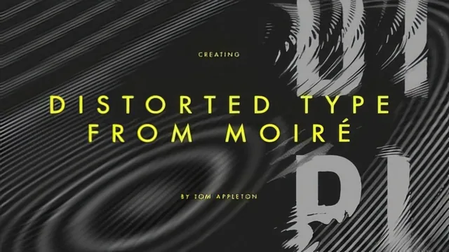
A 14-minute Illustrator-to-Photoshop trick for warping type with moire patterns, not a full design course.
What the course actually covers
This is a narrow, technique-focused course built around a single Photoshop trick: using a moire pattern as a displacement map to distort type. It runs four short lessons and covers exactly what the title promises, nothing more. The arc is straightforward: build a busy pattern in Illustrator, break it up further in Photoshop, convert it to a grayscale displacement map, then apply that map to type through Photoshop's Displace filter.
The pattern-making stage relies on Illustrator's Scribble effect, applied to a black square, with variables like curviness, spacing, and stroke width producing different textures. The course treats this part quickly, showing a few settings without explaining the underlying logic of why certain combinations of curviness and spacing produce a more usable pattern than others. Viewers are largely left to trial and error, which the instructor acknowledges outright rather than working through systematically.
The core lesson is the Displace filter itself. After exporting the Illustrator pattern as a flattened, grayscale file, the course walks through applying Photoshop's Wave filter to add further distortion, then using that file as the displacement map on a white type layer. The horizontal and vertical scale values in the Displace dialog are shown at a couple of different settings so viewers can see how stronger or weaker distortion changes the outcome. This is the most concrete, teachable moment in the course, and it is demonstrated clearly enough to replicate immediately.
Strengths and limitations
The final lesson is where the course earns its keep. Rather than stopping at one pass of displacement, it revisits the process with a denser, less detailed background pattern, then shows how displacing an already-displaced type layer a second time produces a more layered, textured result than either version alone. That compounding idea, apply the effect, then apply it again with a different source pattern, is the one genuinely useful insight that extends past a basic filter demo.
The course's biggest weakness is its assumption of prior fluency. There is no explanation of what a displacement map actually is beyond "gray equals movement," no discussion of why the file must be flattened and grayscale before Photoshop will accept it, and no coverage of common failure points, such as a displacement map that is the wrong size or color mode. Menu paths and settings are named quickly, and viewers unfamiliar with either program's interface will need to pause frequently to keep up.
There is also no finished project to work toward. The course ends with loose experiments rather than a resolved piece of typography, poster, or design applied to any real context. That fits the stated goal of teaching a technique rather than a deliverable, but it means viewers leave with a filter trick rather than a portfolio piece.
At fourteen minutes, this is best treated as a quick reference rather than a structured lesson plan. It suits someone who already has the software skills and wants to see displacement mapping demonstrated once, clearly, so they can go experiment on their own. It is a poor fit for beginners to either program, despite the "beginner level" label, since the course never actually teaches Illustrator or Photoshop fundamentals, only assumes them.
The standout
Layering a second round of displacement onto an already-displaced type layer, shown in the final lesson, produces noticeably richer, more organic results than a single pass.
What you will learn
- How to build a moire pattern in Illustrator using the Scribble effect
- How to distort that pattern further with Photoshop's Wave filter
- How to convert artwork to grayscale and save it as a usable displacement map
- How to apply Photoshop's Displace filter to warp type using the map
- How adjusting horizontal and vertical scale values changes the displacement result
- How pattern density and detail level change the final typographic texture
Best for: Designers who already know their way around Illustrator and Photoshop and want one narrow, replicable effect to add to their toolkit.
Skip it if: Anyone new to Illustrator or Photoshop, since the course assumes fluency with layers, effects menus, and file modes and never explains them.