
Composition for Illustration: 10 Drawing Tips in Procreate
Iva Mikles · Illustrator | Top Teacher | Art Side of Life
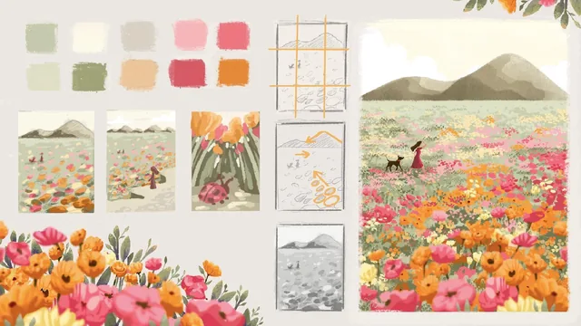
A tight, example-heavy sketchbook walkthrough of ten composition tips that turns vague 'this looks off' feelings into concrete fixes.
What the course actually covers
Iva Mikles builds this class around ten composition guidelines, walked through almost entirely with quick sketchbook shapes rather than finished art. The arc moves from establishing a focal point (the two-box exercise where one darkened circle instantly reads as "the subject") through rule of thirds, composition schemes like the triangle and T-shape, leading lines, negative space, visual weight, color and value balance, unity with variety, and finally static versus active layouts and point of view. The structure holds together: part one is about placement and flow, part two is about emphasis and emotion, and the class close loops back with a slideshow of travel sketches where the viewer is asked to spot which rules are in play before the answer is given.
The teaching method leans on simple shapes on purpose. Circles, triangles, and rough outlines stand in for mountains, seals, houses, and characters so the lesson stays about arrangement, not rendering skill. This keeps the pace brisk across roughly two and a half hours, and it means someone with limited drawing ability can still follow every demonstration and try the same exercise themselves.
Where it delivers and where it thins out
The rule of thirds lesson is the strongest stretch, showing the same seal-on-a-rock scene placed centered, then shifted to an intersection point, then rebuilt across five more environments (mountains, waves, ski slopes, a windowsill cat) so the principle sticks through repetition rather than a single example. The visual weight and color balance lessons are similarly concrete, walking through the same meadow and house sketches four separate times, once for size, once for value, once for color, once for a figure, so each variable is isolated before they get combined.
The value balance lesson, which shows checking a colored sketch in grayscale to catch weak contrast, is a genuinely transferable habit that applies well beyond this specific software. The final review section, where the teacher walks through a stack of real travel sketches and names which rules appear in each, works as a useful test of whether the concepts actually transferred, though it also runs long and repeats the same observations (rule of thirds, leading lines, negative space) enough times that the pacing sags toward the end.
The bonus mountain tutorial is a straightforward Procreate rendering demo, useful as a bonus but not tied tightly to the composition lessons themselves, and its brush-by-brush detail sits oddly against the loose, tool-agnostic sketching that fills the rest of the course.
Verdict
This is a workmanlike, well-sequenced primer on composition fundamentals that would work equally well with a pencil and paper, despite the Procreate framing. It does not teach rendering, color theory in depth, or how to finish an illustration, and it says as much upfront. What it does teach, it teaches through repeated, varied, hands-on examples rather than abstract rules, which is exactly what makes guidelines like the rule of thirds or visual weight actually stick.
The standout
The recurring practice of sketching the same simple scene twice, once unbalanced and once corrected with the rule of thirds, makes the difference between a flat and a pleasing composition immediately visible.
What you will learn
- How to place a story focus so a viewer knows what an image is about within seconds
- Applying the rule of thirds and golden ratio to landscape and character sketches
- Using leading lines, negative space, and overlap to control depth and readability
- Building visual weight and hierarchy through size, value, and color contrast
- Balancing unity and variety so grouped elements read as one clear scene
- Reading static versus active compositions and adjusting point of view for mood
Best for: Illustrators and hobbyist sketchers who already draw but want a vocabulary and checklist for arranging scenes, backgrounds, and travel-sketchbook style story moments.
Skip it if: Absolute beginners who have never drawn a shape or held a stylus, and anyone wanting rendering, coloring, or finished-illustration polish rather than layout theory.