
Color Theory for Illustrators: A Fun Beginner’s Guide to Creative Color
Brooke Glaser · Illustrator
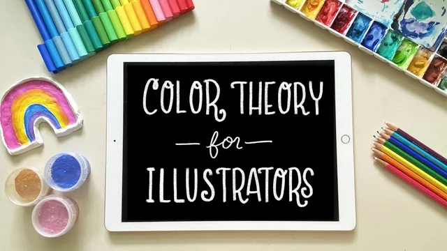
A 57-minute primer that replaces vague color instinct with three testable variables (hue, saturation, value) and honest fixes for five common beginner mistakes.
What it actually teaches
Brooke Glaser opens by naming the three variables that make up color: hue, saturation, and value, and spends the first three lessons isolating each one before letting them interact. The household-object color wheel exercise, sorting items by hue to see where a red tips toward orange or purple, is a deliberately physical way to slow down a beginner's eye rather than hand them a swatch chart to memorize. The value lesson goes further than most beginner color classes by demonstrating that hues carry different natural brightness ceilings, using a side-by-side yellow-versus-blue desaturation test to prove that a bright yellow will always read lighter than even a pale blue. That single demonstration does more to explain why some color pairings go muddy than a page of theory would.
The middle of the course turns diagnostic. Five common mistakes get named and shown with corrected examples: too many hues, oversaturation across an entire piece, flat value contrast, forgetting to plan around the background color, and being overly literal about real-world color (the flamingo-legs-in-navy example makes the point plainly). This section works because it pairs each mistake with a visible before-and-after rather than just describing the problem. The shading lesson is the strongest single stretch in the course. Instead of the common beginner habit of just adding black to a base color, Glaser shows that a good shadow color is usually more saturated and slightly shifted in hue than the base tone, and demonstrates the difference using a skin-tone example that looks genuinely better once corrected.
Palettes, eye direction, and the real-world caveats
The color harmony lesson runs through monochromatic, analogous, complementary, split-complementary, and tetradic schemes, but the more useful teaching is Glaser's admission that she rarely starts from a named harmony. She builds palettes by eyedropping colors from photos and mood boards she finds appealing, then checks the result against the harmony rules only when something feels off. That reframes the harmonies as a troubleshooting tool rather than a recipe to follow from scratch, which is a more honest and more usable framing for a beginner than most color-wheel lessons offer.
The lesson on directing a viewer's eye through saturation, hue contrast, and especially value contrast (the dark-line-next-to-white-highlight example) ties directly back to the earlier value lesson, giving the course a real throughline rather than a list of disconnected tips. The closing stretch on optical color tricks (the checkerboard illusion, the dress photo, pointillism) and on CMYK versus RGB for printing and scanning is useful context, though it's more "things to be aware of" than a skill to practice, and the printing section in particular stays at the level of general awareness rather than a workflow a reader could follow step by step.
Where it falls short
At under an hour, the course cannot go deep on any one topic, and it doesn't try to. There is no structured painting project that ties all the lessons together into one finished piece with a rubric to check against; the class projects are smaller, separate sketches per exercise. Viewers wanting technical depth on color management, digital-to-print calibration, or advanced palette-building software will need a different resource. What the course does deliver is a compact, well-sequenced set of habits, checking saturation, checking value contrast, checking the background before finalizing, that a beginner can start applying to their very next piece.
The standout
The shading lesson's contrast between a shifted-saturation, slightly-hue-shifted shadow color and a simply-darkened one, shown side by side so the visual difference is unmistakable.
What you will learn
- Distinguish hue, saturation, and value as separate variables and diagnose which one is failing in a weak color choice
- Shade by shifting saturation and hue rather than just adding black, using the multiply blend mode as a digital shortcut
- Fix the five recurring color mistakes: overusing hues, oversaturating everything, weak value contrast, ignoring background color, and being too literal about real-world color
- Build palettes from color harmonies (monochromatic, analogous, complementary, split-complementary, tetradic) as flexible starting points rather than rigid rules
- Use saturation, hue contrast, and value contrast deliberately to direct a viewer's eye to the focal point of a piece
- Choose between RGB and CMYK for digital art headed to print or screen, and understand why scanned or printed color will drift from the original
Best for: Beginner and hobbyist illustrators who already draw or paint but pick colors by instinct and want a vocabulary and a few repeatable checks for why a piece feels off.
Skip it if: Anyone with formal color training, working painters already fluent in value scales and harmonies, or students wanting deep technical color management (color profiles, gamut mapping, print calibration workflows).