
Character Design Crash Course: Designing Animal Characters
Melissa Lee · allow yourself to fail before you succeed
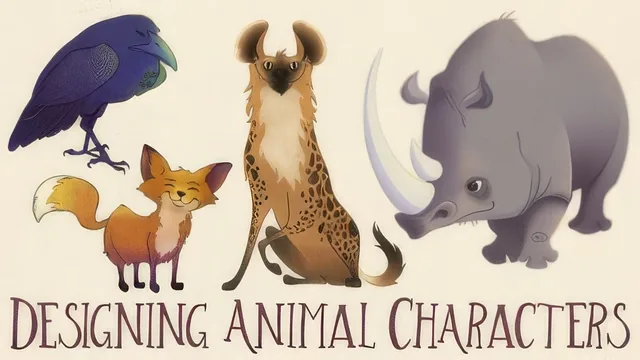
A designer's personal process for pushing an animal sketch into a finished Photoshop character, in under an hour of runtime.
Melissa Lee's course promises a full pipeline, from inspiration to a finished Photoshop render, and it mostly delivers that arc in under an hour. The structure is sound: two lessons on inspiration and fundamentals, one on reference technique, a practice exercise, then sketching, coloring, and rendering. It reads as a condensed studio walkthrough rather than a structured curriculum, and that honesty about scope, calling itself a crash course, sets expectations correctly.
What actually gets taught
The fundamentals lesson is the conceptual backbone. Lee names four pillars, shape, silhouette, rhythm, and construction, then explains each with specific visual traps to avoid: the "ladder" effect of same-sized, evenly spaced elements, and the "bowling ball" effect of a face where the eyes and nose share the same size and shape. She ties this to the golden ratio, showing how a roughly 1-to-1.6 proportion between a character's upper and lower body sections shows up in her own designs, in Disney models, and even in real horse anatomy. It is a compact, useful way to think about proportion without turning it into math homework.
The reference lesson is the strongest single stretch. Lee pushes back directly on the idea that using reference is cheating, then demonstrates a specific method: draw directly over a photo of an animal repeatedly to internalize its proportions, then lower the opacity of that realistic sketch on a new layer and draw over it again, this time exaggerating and caricaturing. That layered progression from observation to stylization is the one technique in the course that justifies the runtime on its own, because it gives a repeatable answer to the vague advice "use reference" that most tutorials leave unresolved.
Where it thins out
The two Photoshop lessons are the weakest link, and the course's own updated note admits as much. Blocking in color with the Pen tool involves toggling the Paths panel, converting paths to selections, and filling them with the Paint Bucket, all standard but dependent on an older Photoshop interface. The custom radial gradient setup, building a foreground-to-transparent gradient from scratch in the Gradient Editor, is a genuinely handy trick, but it is delivered as a screen-recorded click-through rather than a technique explained in principles that would transfer to Procreate or Fresco, which Lee says she now uses instead.
The sketching lesson also glosses over its own most interesting moment. Lee shows a full page of character iterations and explains she picked the least generic one, but the reasoning behind why the chosen design "reads" better than the others is thin, more a personal preference stated aloud than a teachable rule.
Overall, this is a personal-workflow tour more than a rigorous course. It works best as a supplement for someone who already draws animals reasonably well and wants a second opinion on how a working illustrator organizes the sketch-to-render pipeline, not as a first introduction to either character design or digital painting.
The standout
The reference-to-exaggeration workflow in the Using Reference lesson, tracing a realistic rhino repeatedly before pushing the same shapes into a caricatured design, gives a concrete, repeatable method for turning observation into stylization.
What you will learn
- How to gather artist and reference inspiration before designing a character, and why studying multiple artists builds versatility
- How the golden ratio (roughly 1 to 1.6) applies to proportioning a character's body sections
- How to avoid the ladder and bowling ball effects by varying shape size and form across a face or body
- How to use reference photos as an underlay, drawing over them repeatedly to build muscle memory before exaggerating a design
- How to build clean color-fill shapes with the Pen tool and Paths panel, converting paths to selections for flat color blocking
- How to set up a custom foreground-to-transparent radial gradient in Photoshop for soft, atmospheric shading
Best for: Illustrators who already sketch and know basic Photoshop navigation but want a working process for turning animal reference into a stylized, portfolio-ready character.
Skip it if: Absolute beginners with no drawing or Photoshop experience, and anyone using only Procreate or Fresco since the two rendering lessons rely entirely on legacy Photoshop pen and gradient tool workflows.