
Brand Illustration: Create Unforgettable, Stylized Brand Imagery
Roman Muradov · Illustrator
A 46-minute philosophy talk on originality, not a technique tutorial, best suited to illustrators stuck in a rut.
Roman Muradov's class is less a tutorial than a short essay in video form about where original brand illustration comes from. Across nine brief lessons, totaling under an hour, he walks through building a fictional brand from scratch, an app called Cloudscraper that lets users sculpt shapes out of clouds, and uses that invented project as the spine for a discussion of concept, character design, mockups, and presentation.
What the course actually covers
The opening lessons spend real time on a single argument: that brand illustration looks repetitive because artists copy their contemporaries, and the fix is to pull influence from unrelated places, old literature, graffiti, abstract painting, personal doodling, rather than from other brand work. This is the intellectual core of the class, and it is argued well, with a specific anecdote about a personal Instagram experiment that led to a paying branding job for the app Collect.
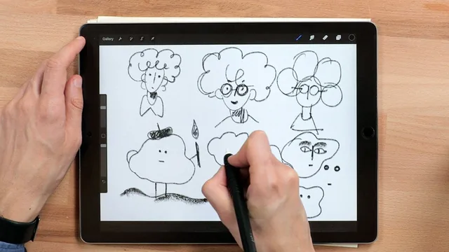
From there the course moves into more concrete territory, though still lightly. Developing a name and concept is demonstrated live: Muradov riffs on words like Cloudscraper, sketches a rough C-S logo, and settles on a tagline, all while narrating his thought process. The character design lesson does the same for imagery, showing how a cloud creature gets reduced to a circle, a tuft, and a nose, then rebuilt with just enough detail to read as a character without becoming fussy. A short lesson on constraints, capping a character at ten lines, for instance, gives one genuinely reusable rule for beating a blank page.
The mockup lesson is the closest thing to a technical demo, showing rough color blocking in Procreate to help a hypothetical client picture the final piece before polished art exists. The closing lessons on refining style and presenting work are more reflective than instructional, covering things like audience awareness, representation in character design, and the value of stepping away from a piece before final revisions.
The Notion case study
The bonus case study on the Notion branding is the strongest single section. Rather than a generic before-and-after, it explains a specific constraint that shaped the whole style: a single unbroken gesture defining each shape, no built-up linework, chosen to match the product's minimalism. It also makes an argument worth sitting with, that the simplicity everyone imitated was only reachable after a large volume of discarded, more elaborate drawing, and that copying the end result without doing that groundwork explains why so many imitators miss the mark.
Where it falls short
The course is thin on repeatable technique. There is no drawing exercise to follow along with, no breakdown of brush settings or line weight beyond passing mentions, and no structured project brief students can adapt to their own brand. Someone hoping to learn Procreate workflow, character construction rules, or a client-presentation template will find only fragments. The 46-minute runtime also means several ideas, particularly around representation and audience, get raised and dropped in a sentence or two rather than developed.
This suits its stated audience, illustrators already comfortable with client work who want a nudge toward more personal style, better than beginners. Anyone newer to illustration or brand work will likely finish it inspired but without a clear next step.
The standout
The reframing of minimalist style as the trimmed-down result of an enormous, mostly-discarded body of exploration, illustrated directly through the Notion case study.
What you will learn
- How to pull creative influence from unrelated fields (literature, graffiti, outsider art) instead of copying industry peers
- A method for developing a brand name and visual concept in tandem so word and image reinforce each other
- How to reduce a character or object to basic abstract shapes and then decide how much detail to add back
- How to build a quick, low-fidelity color mockup to help clients visualize a direction before final art
- How to use self-imposed constraints (line count, palette, medium) to start work without waiting for inspiration
- How the Notion illustration style was actually built, including why its apparent simplicity took extensive groundwork
Best for: Working illustrators or designers with client experience who already know standard brand-illustration workflows and want a mindset shift toward personal, less generic style.
Skip it if: Beginners looking for step-by-step drawing instruction, software tutorials, or a structured business/client-process course.