
Anyone Can Brush Letter: Easy Modern Calligraphy For Complete Beginners With Worksheets
Yasmina Creates · Artist & Creativity Cheerleader
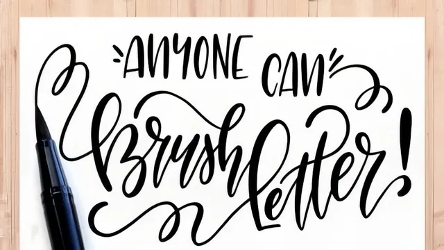
A genuinely thorough 76-minute foundation for brush lettering, but its most valuable idea (learning by copying) arrives last, almost as an afterthought.
A drill-first approach to a decorative skill
This class opens with a promise that anyone can brush letter, and then spends most of its 76 minutes proving it through repetition rather than persuasion. After a short overview of what brush lettering is (a looser, brush-pen-driven descendant of nib calligraphy) and a genuinely useful supplies lesson that ranks brush pens by difficulty, from small disposable tips like the Tombow Fudenosuke up through bristled Pentel brushes, the course settles into its real spine: three guided worksheets covering warm-up drills, lowercase letters, and uppercase letters. This is where the teaching actually happens, and it happens through muscle memory rather than theory.
The drills lesson is the most valuable stretch of the class for a true beginner. Rather than jumping straight to letterforms, it isolates the single skill that makes brush lettering work: controlling pressure to produce a thin upstroke and a thick downstroke. The instructor walks through infinity-sign loosening exercises, then a progression of straight strokes, thin-to-thick-to-thin curves, and connected L-shapes, each one mapped directly onto the letter combinations that will use it later. By the time the lowercase alphabet lesson begins, the letters read less like new shapes to memorize and more like recombinations of movements already practiced.
The letter-by-letter lessons, however, are also where the pacing strains. Both the lowercase and uppercase alphabets are taught in near-continuous narration, letter after letter, with the instructor frequently pausing to show two or three stylistic variations of each one. That variety is useful for building an eye for personal style, but it also means a beginner working along in real time will likely need to pause and rewind constantly to keep up, since the class moves at demonstration speed rather than practice speed.
Where the real technique lives
Two lessons stand out as more substantial than their brief runtime suggests. The "Getting Fancy" lesson introduces bounce lettering, flourishes, and, more usefully, a concrete planning method: sketching a thumbnail layout and assigning a word hierarchy (which words matter most) before inking a finished piece. Using the phrase "you stole my heart" as a worked example, it shows how identifying that "heart" should read as the largest, most emphasized word changes every downstream decision about scale and flourish placement. This is the closest the class comes to teaching composition rather than just letterforms.
The closing lesson on copying as a learning tool is the most conceptually important part of the course, and it is a shame it is relegated to a coda. The instructor makes a direct, sensible case that tracing and copying other letterers' work, using a light box, tracing paper, or even lowered-opacity type in an image editor, builds observation and muscle memory faster than working from imagination, provided it stays private practice rather than published as original work. It is sound advice that would have served students better placed earlier, as a companion to the drills rather than a wrap-up thought.
What the course does not really deliver is finished-project depth. The single closing assignment (letter one word or short phrase) is open-ended almost to a fault, with no rubric or example progression to check work against beyond the community gallery. Students wanting a step-by-step walkthrough of a complete, framable piece will find only the one worked "you stole my heart" example, itself narrated quickly. For a first class in the medium, though, the fundamentals are genuinely sound, and the drills alone justify the sitting.
The standout
The 'faux calligraphy' technique of drawing thick downstrokes onto a regular pen line gives total beginners a way to fake the calligraphic look before they can control an actual brush.
What you will learn
- How to hold and angle a brush pen (or a Crayola marker) to consistently produce thin upstrokes and thick downstrokes
- The vocabulary of letterform anatomy: baseline, x-height, cap height, ascender and descender
- A full lowercase and uppercase alphabet built from repeatable stroke patterns, not memorized shapes
- How to connect letters into words while keeping spacing and slant consistent
- How to plan a finished piece with a thumbnail sketch and word-hierarchy before inking it
- How and why to deliberately copy other letterers' work as a legitimate practice method
Best for: Complete beginners who have never picked up a brush pen and want a structured, drill-based on-ramp rather than a stylized showcase of finished pieces.
Skip it if: Anyone who already knows the basic thick-thin stroke and wants advanced flourishing, composition work, or a fast-paced class that skips the fundamentals.